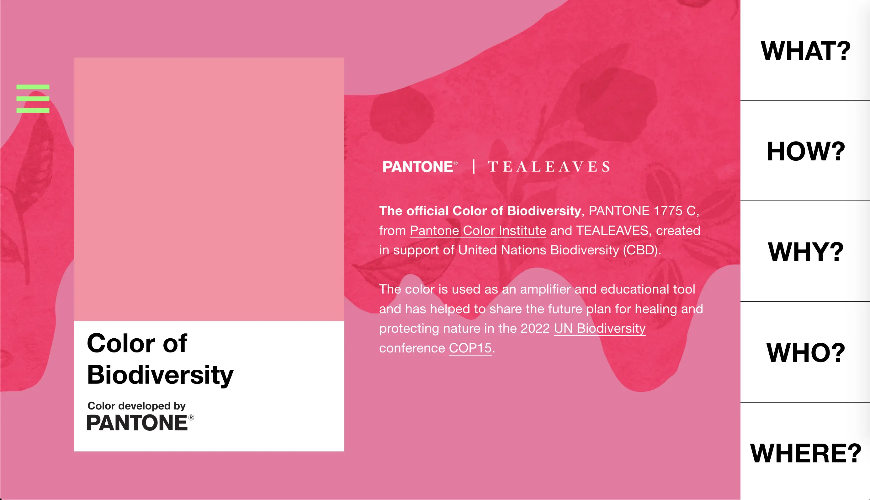
What is the Color of Biodiversity?
PANTONE Color Institute selected a color emblematic of the oldest pigment on earth which was discovered in 1.1-billion-year-old marine sedimentary rocks of the Taoudeni Basin in Mauritania, West Africa, by Dr. Nur Gueneli.
Featured In
Designing the Experience
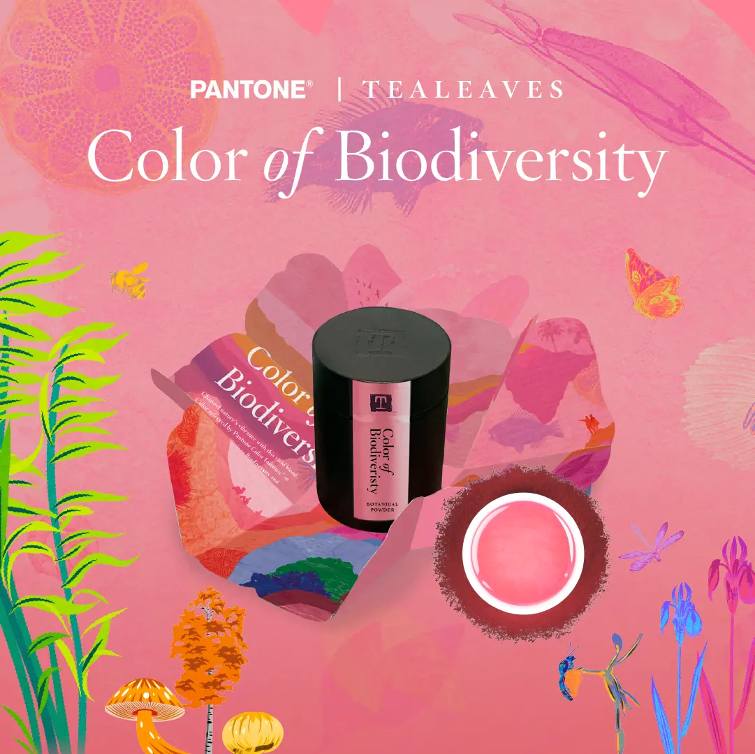
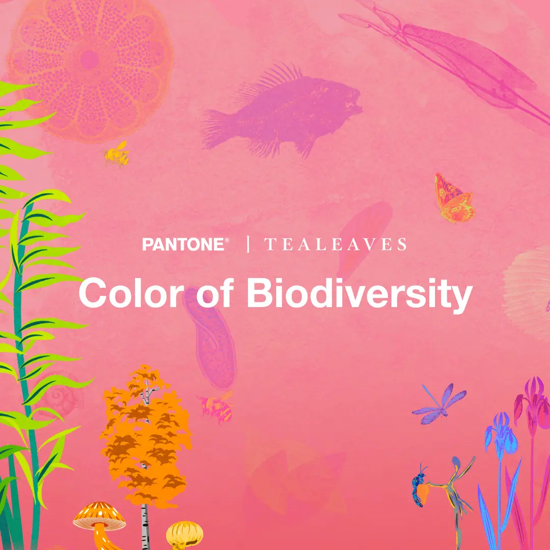
Collaborating with PANTONE, we created a custom botanical tea blend that perfectly embodies the Color of Biodiversity. I had the pleasure of leading the design and development of the official web experiences on TEALEAVES and NatureXDesign, as well as working with our talented Design team to create engaging social media assets that raise awareness about biodiversity loss.
Design Process
Like the Biodiversity Design Hub, our web experience is a vibrant celebration of nature's diversity and charm. The Design Team and I started with ideation, sketching, and Figma low-fidelity mockups. After designing an intuitive user experience that seamlessly showcases the project's mission, information, case studies, and resources through our vertical tabbing system, we integrated visuals from the Color of Biodiversity packaging. This unification of branding and style has brought an added layer of impact to our campaign.