1 / 12
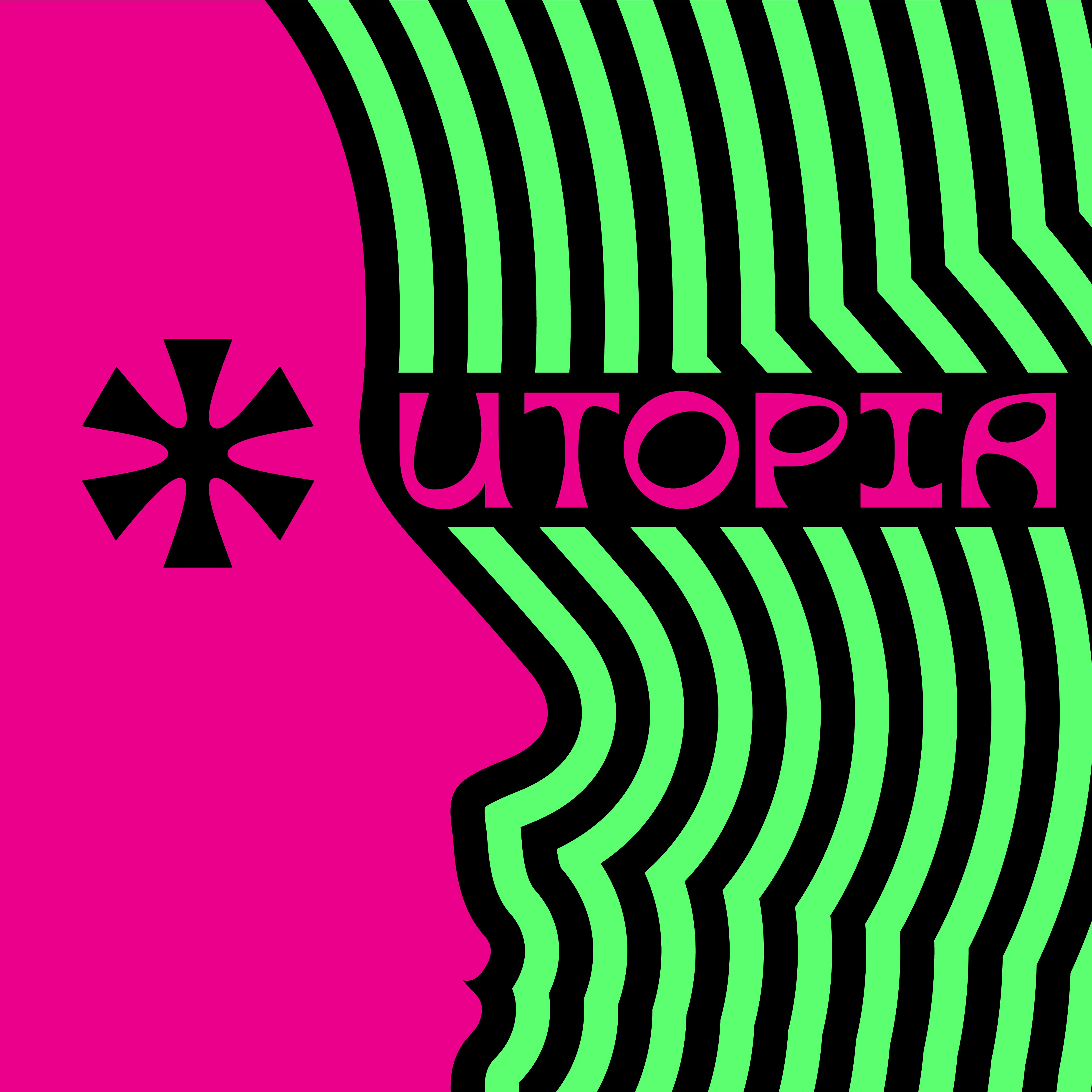
UTOPIA Type Specimen Cover
2 / 12
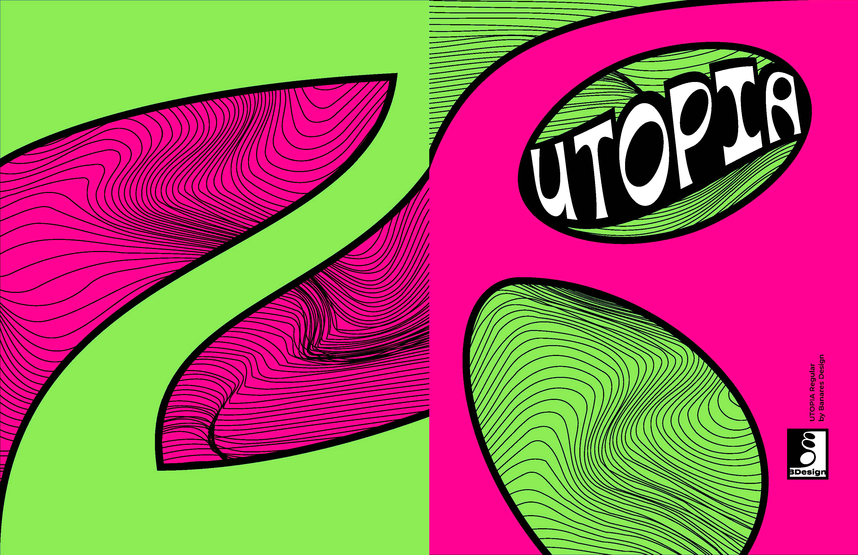
Inside Front and Back Covers
3 / 12
4 / 12
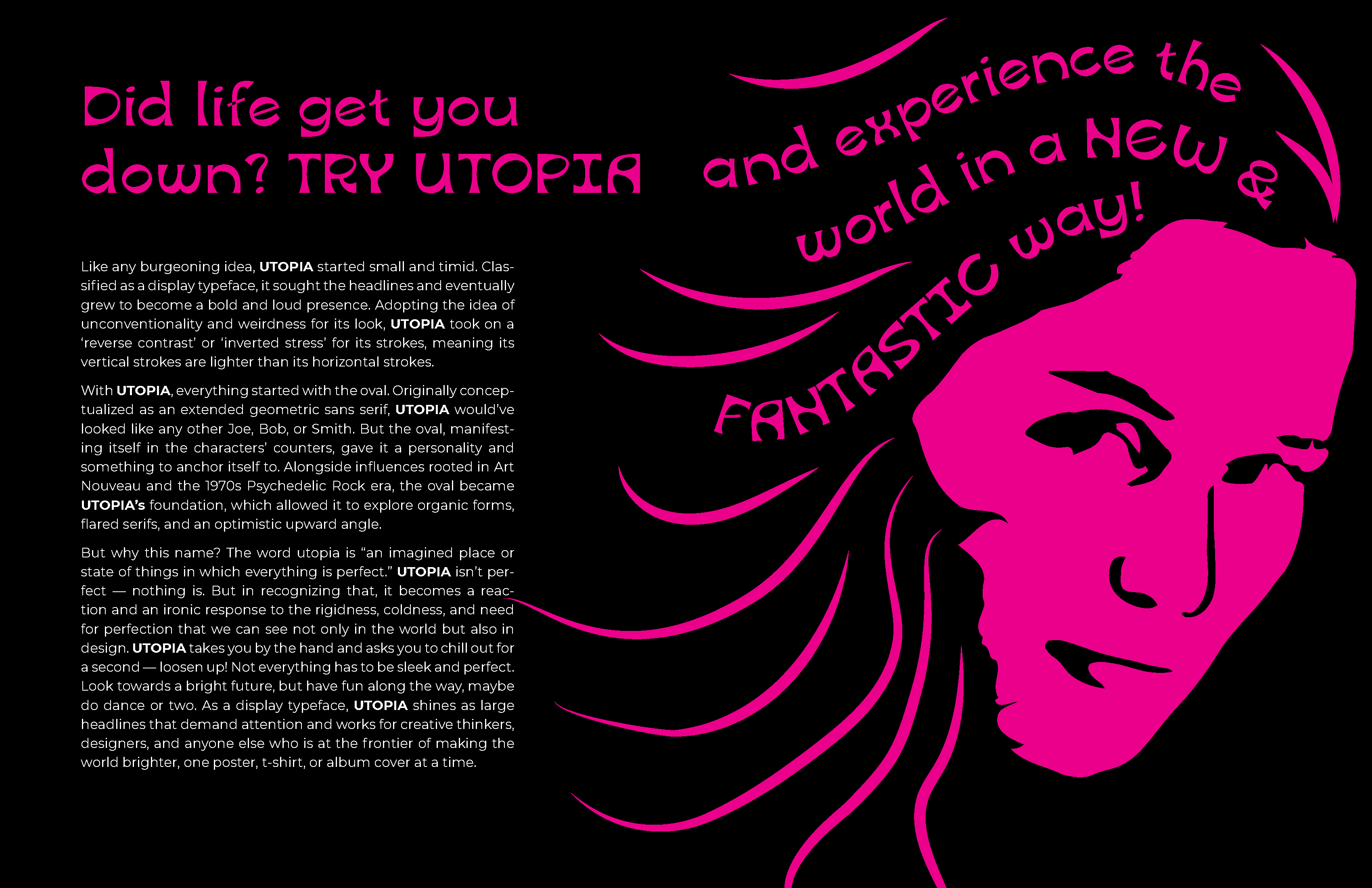
UTOPIA Full Description
5 / 12
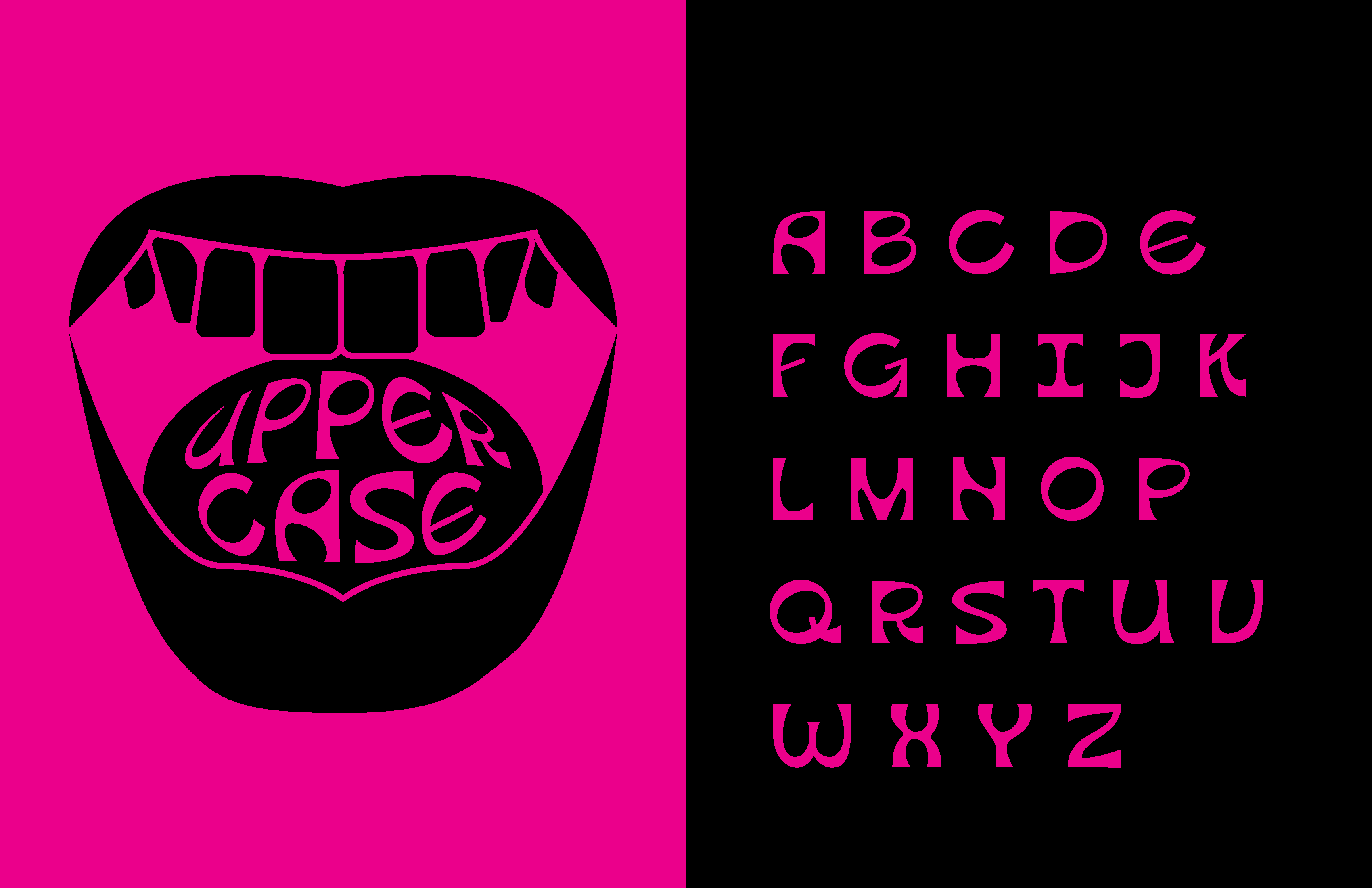
UTOPIA Uppercase Alphabet
6 / 12
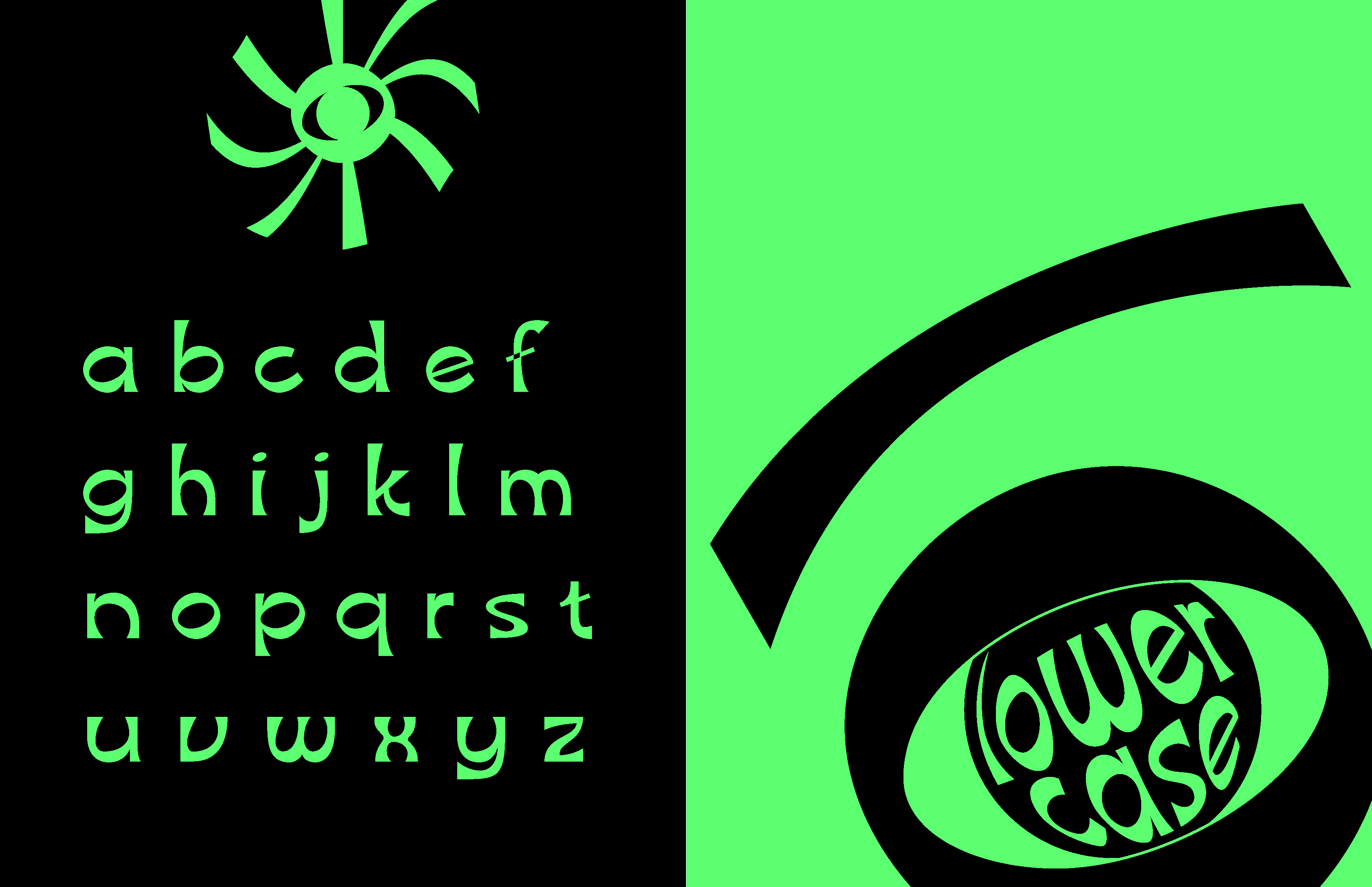
UTOPIA Lowercase Alphabet
7 / 12
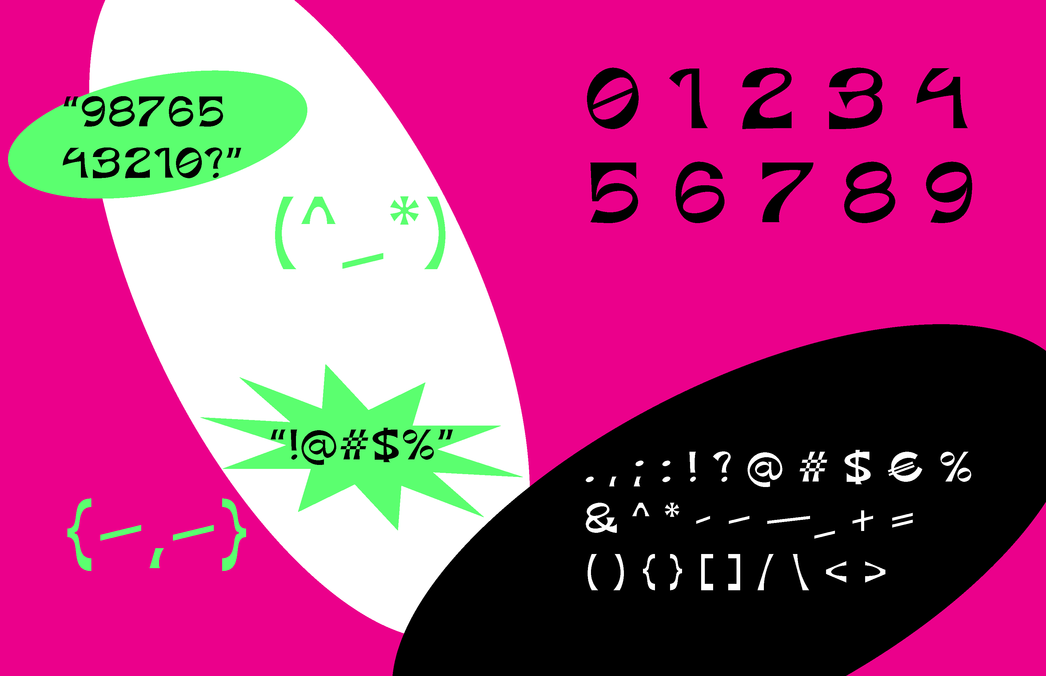
UTOPIA Numbers and Symbols
8 / 12
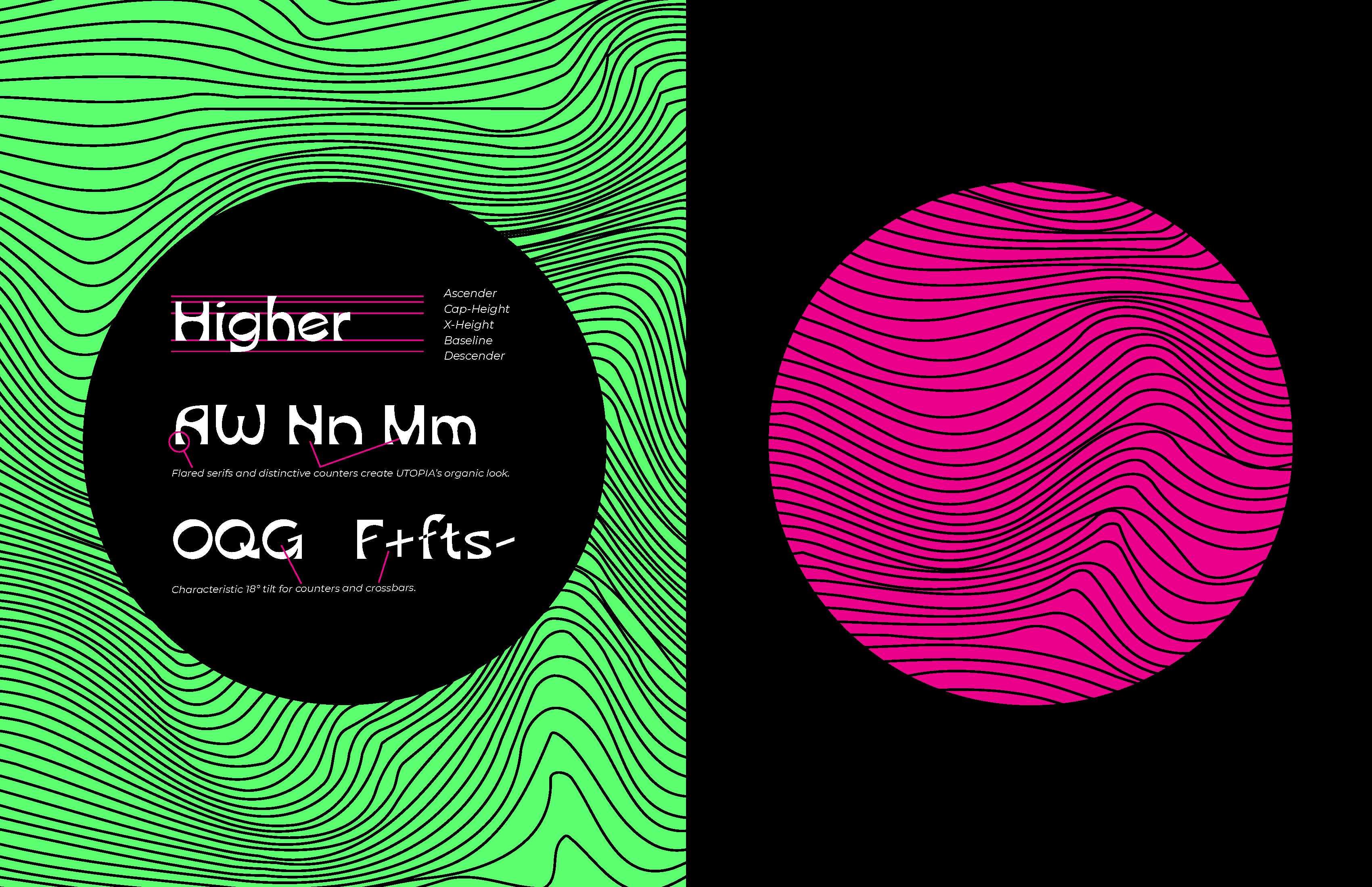
Anatomy
9 / 12
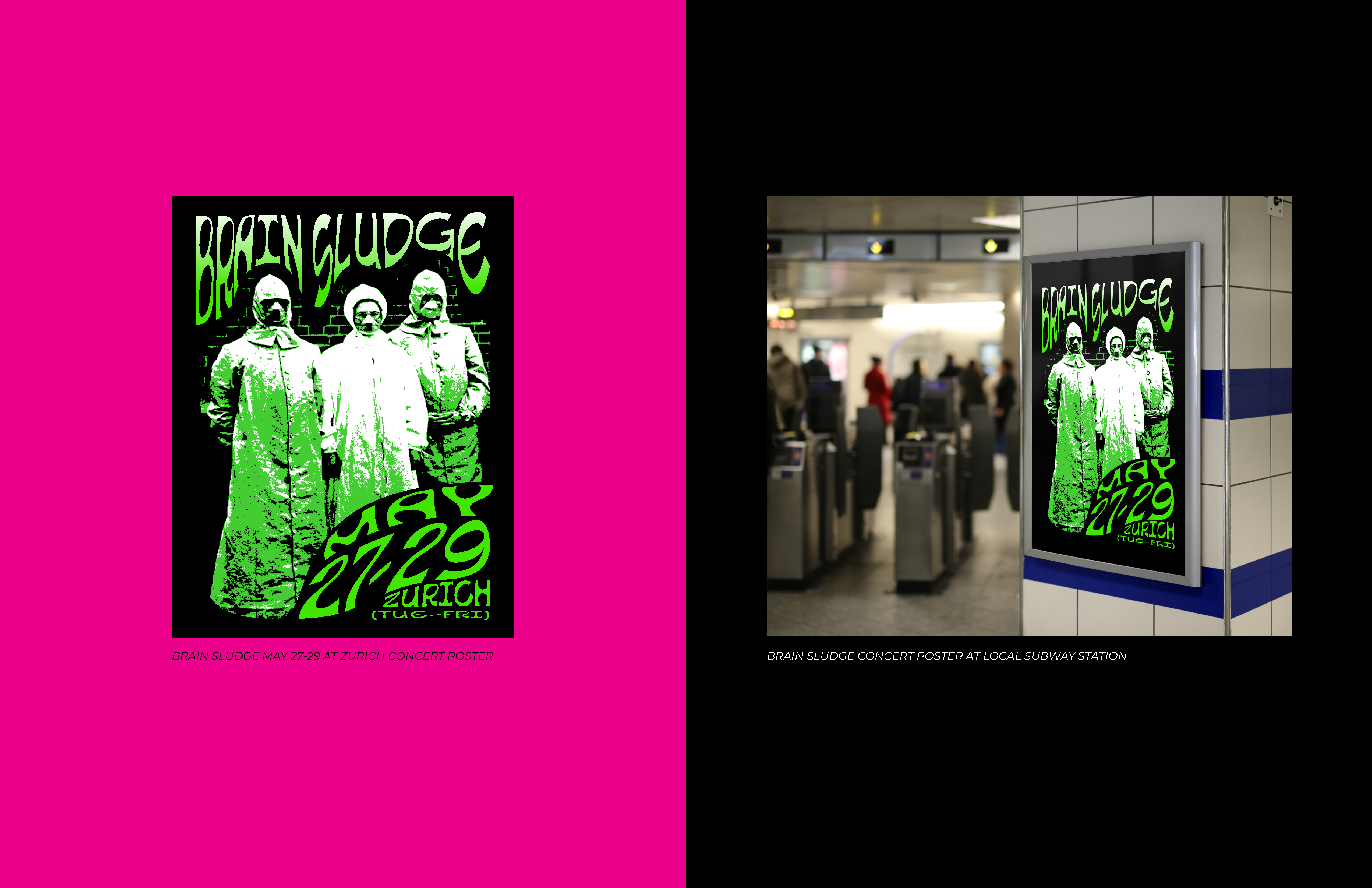
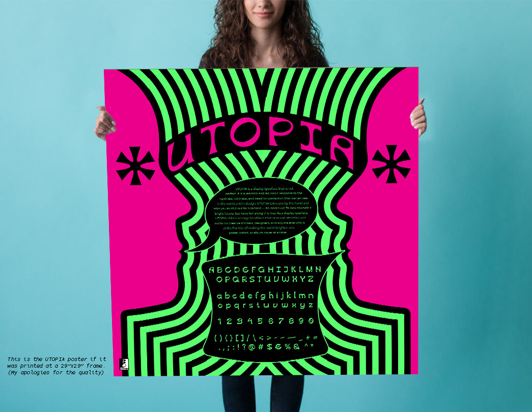
UTOPIA Typeface Application — Poster
10 / 12
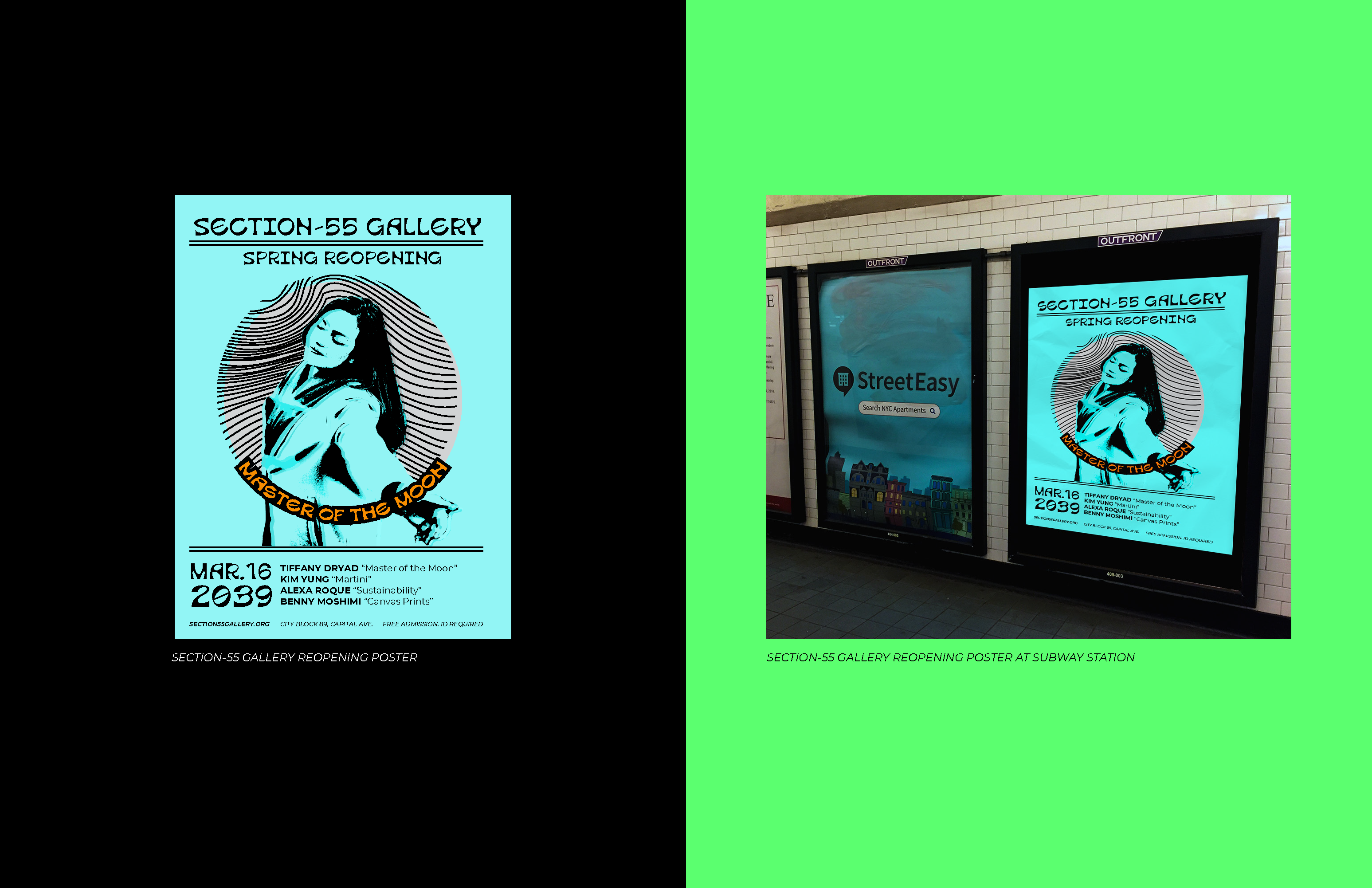
UTOPIA Typeface Application — Poster
11 / 12
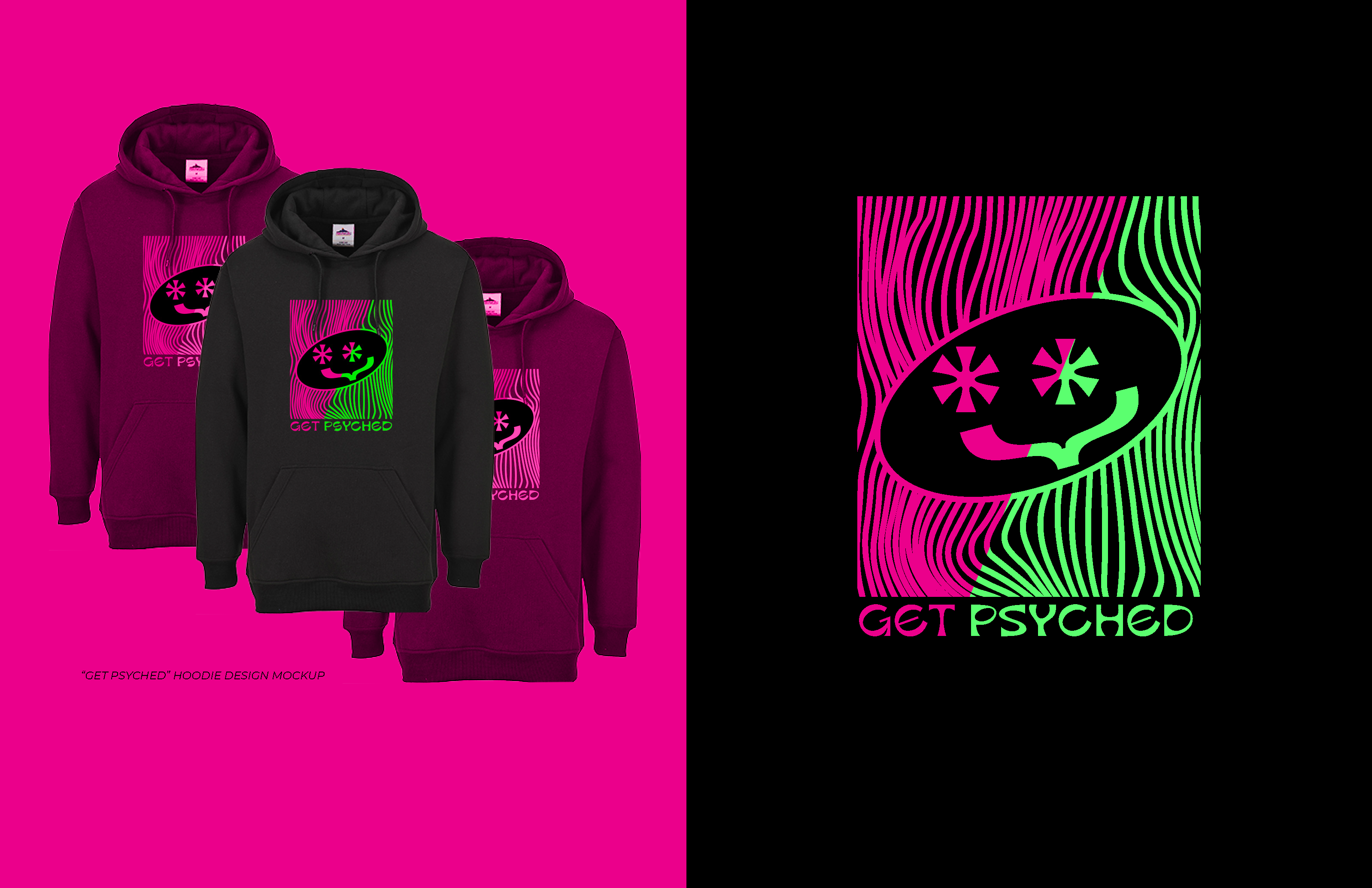
UTOPIA Typeface Application — Apparel
12 / 12
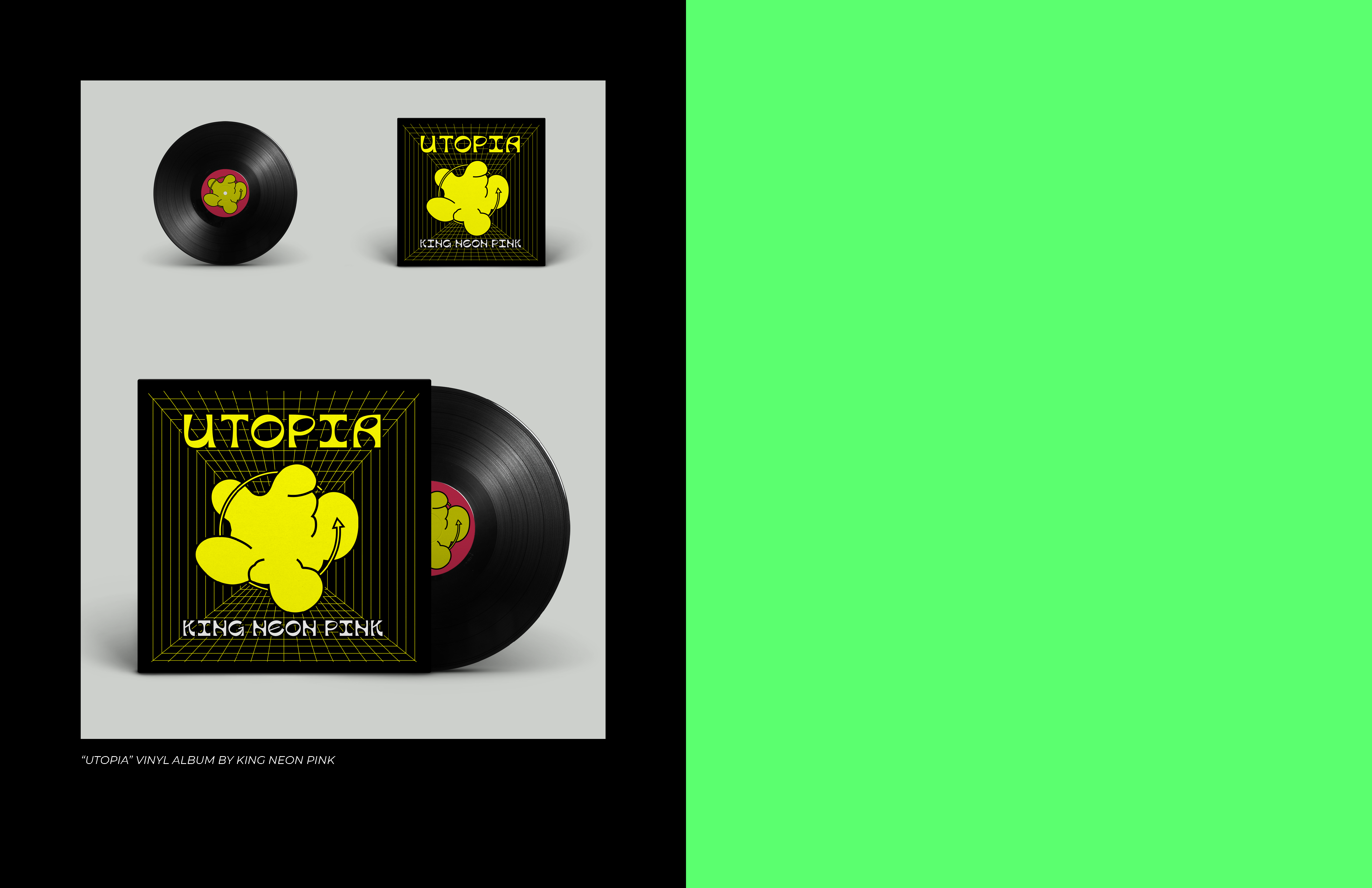
UTOPIA Typeface Application — Album Covers
❮
❯
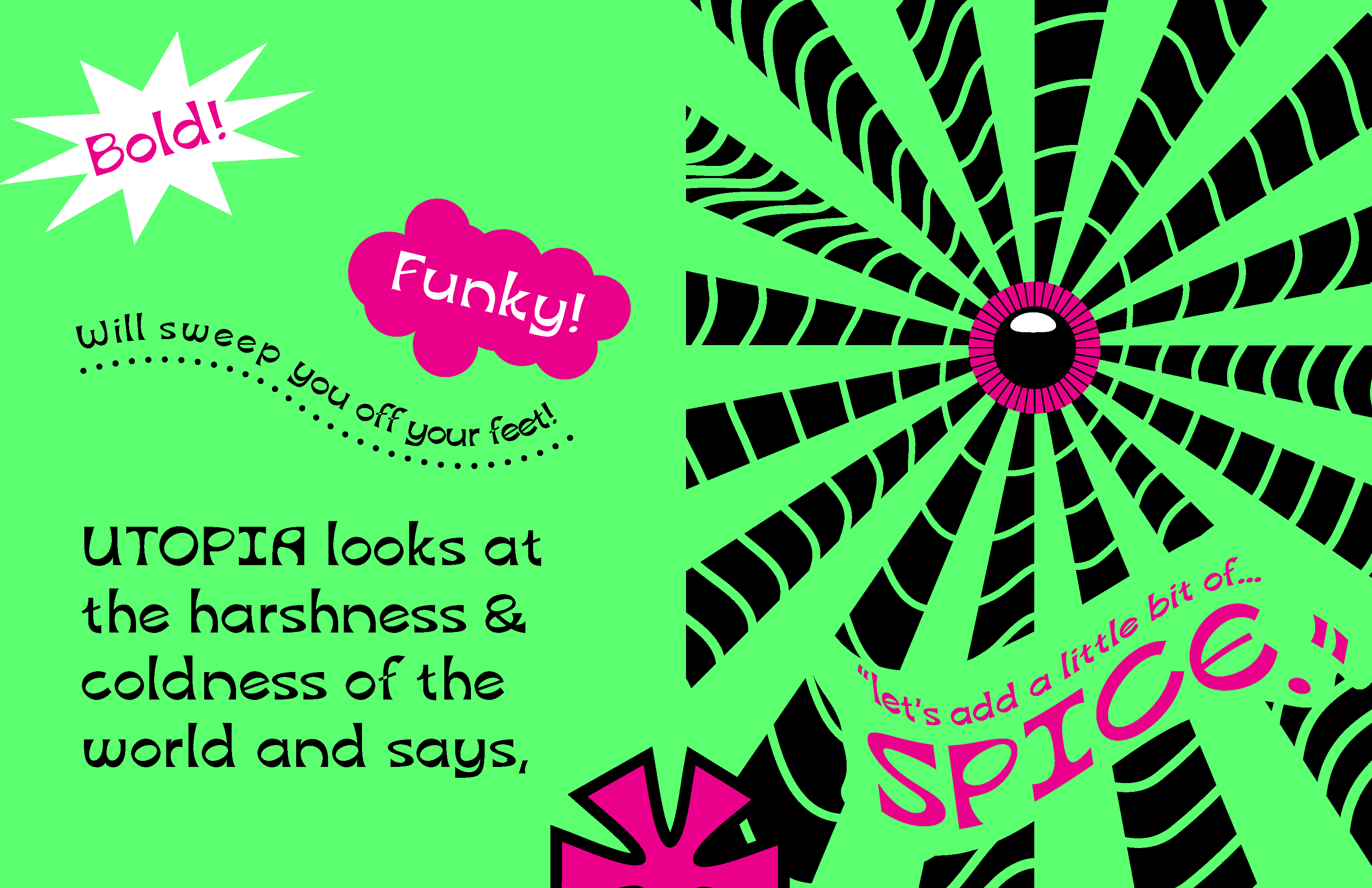
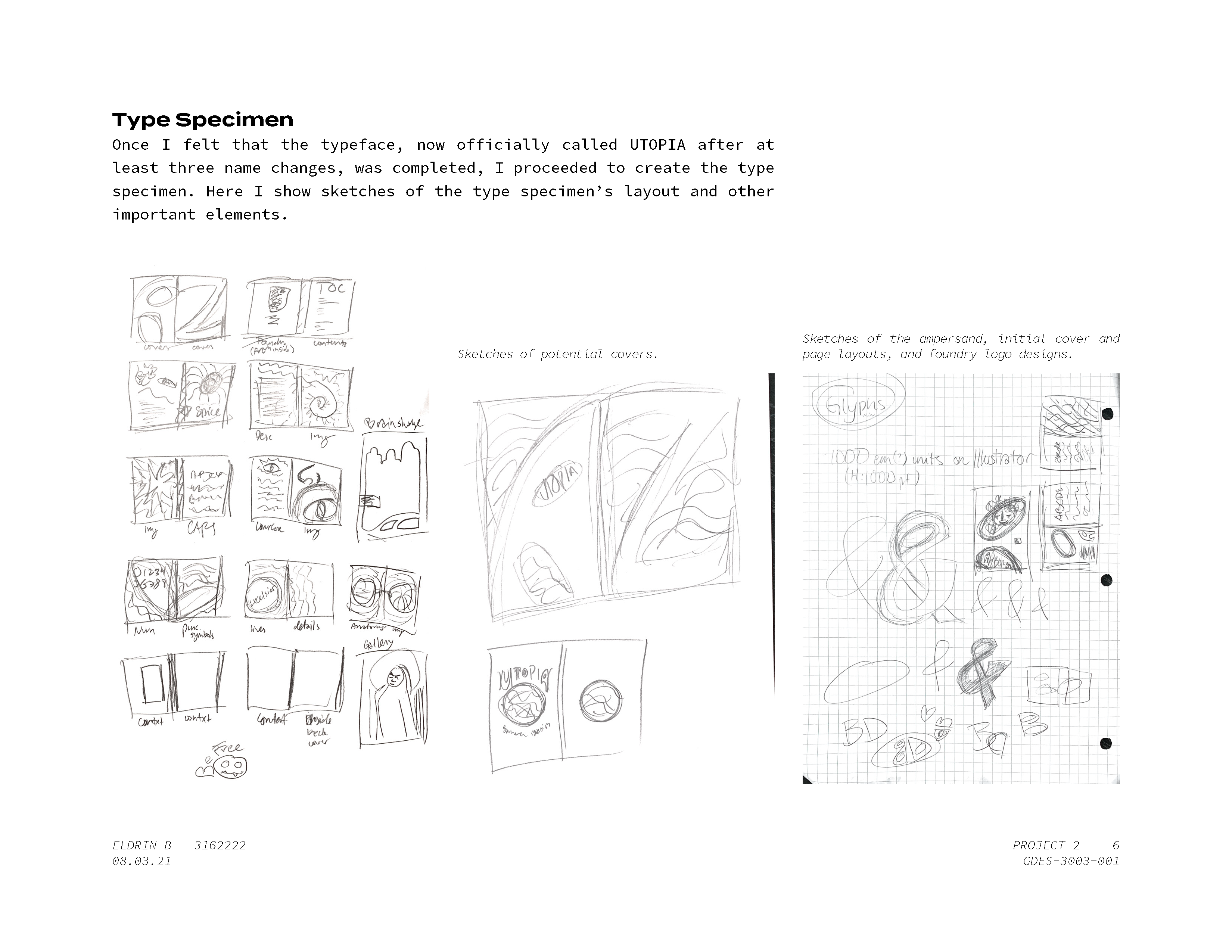
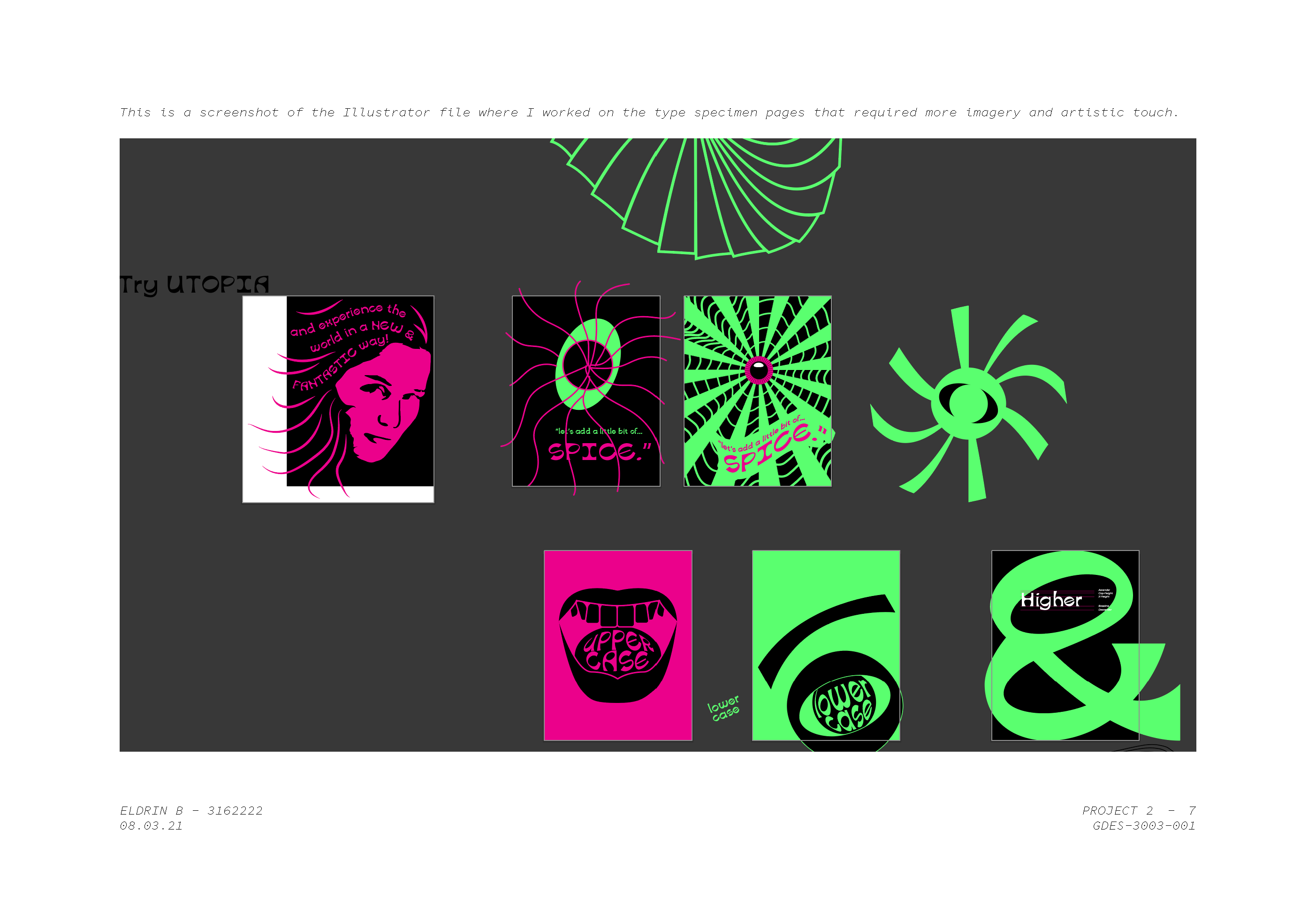
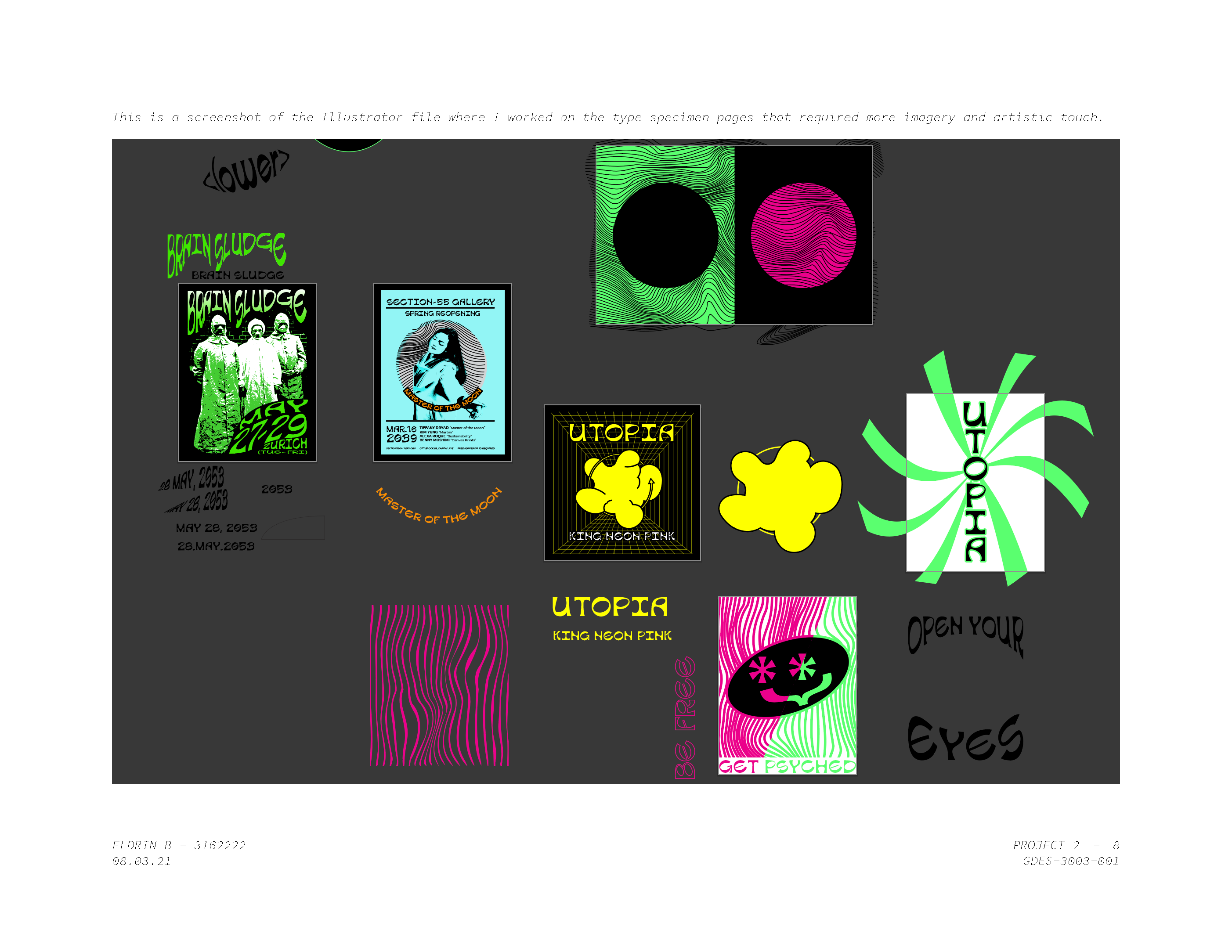
Type Specimen
UTOPIA takes you by the hand and asks you to chill out for a second — to loosen up! To look towards a bright future, but have fun along the way. As a display typeface, UTOPIA shines as large headlines that demand attention and works for creative thinkers, designers, and anyone else who is at the frontier of making the world brighter, one poster, t-shirt, or album cover at a time.
Above is the Type Specimen of UTOPIA. This document includes the alphabet, numbers, symbols, the typeface anatomy, and examples of its application.
Design Process
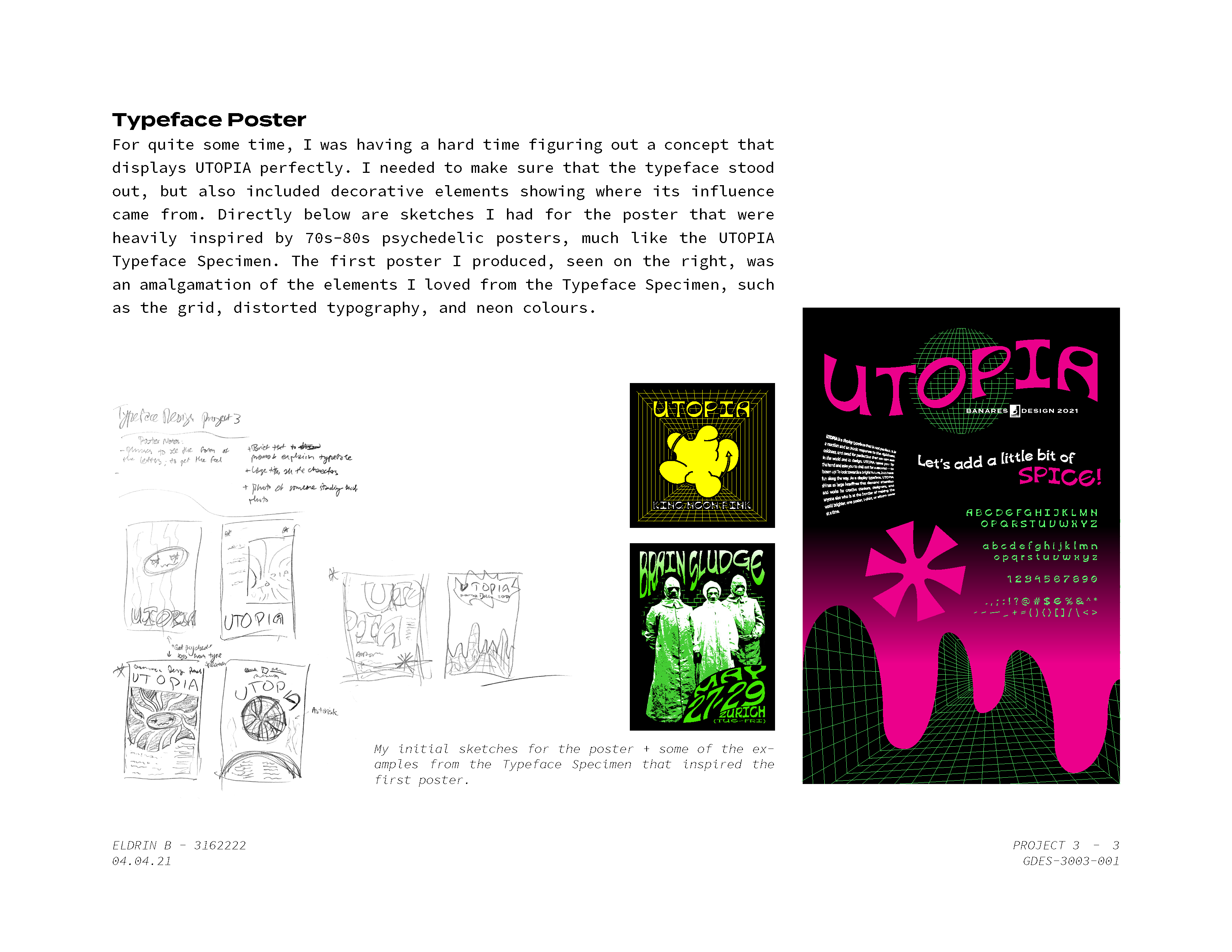
The creation of UTOPIA came in three projects as part of the semester-long exploration of designing a typeface. Seen below are each projects’ process beginning with the form and ideation/revision towards a concrete concept, then towards further refinement and creation of a type specimen. And finally, further typeface refinement culminates in a finalized poster, seen at the beginning of this page.
1 / 7
2 / 7
3 / 7
4 / 7
5 / 7
6 / 7
7 / 7
❮
❯
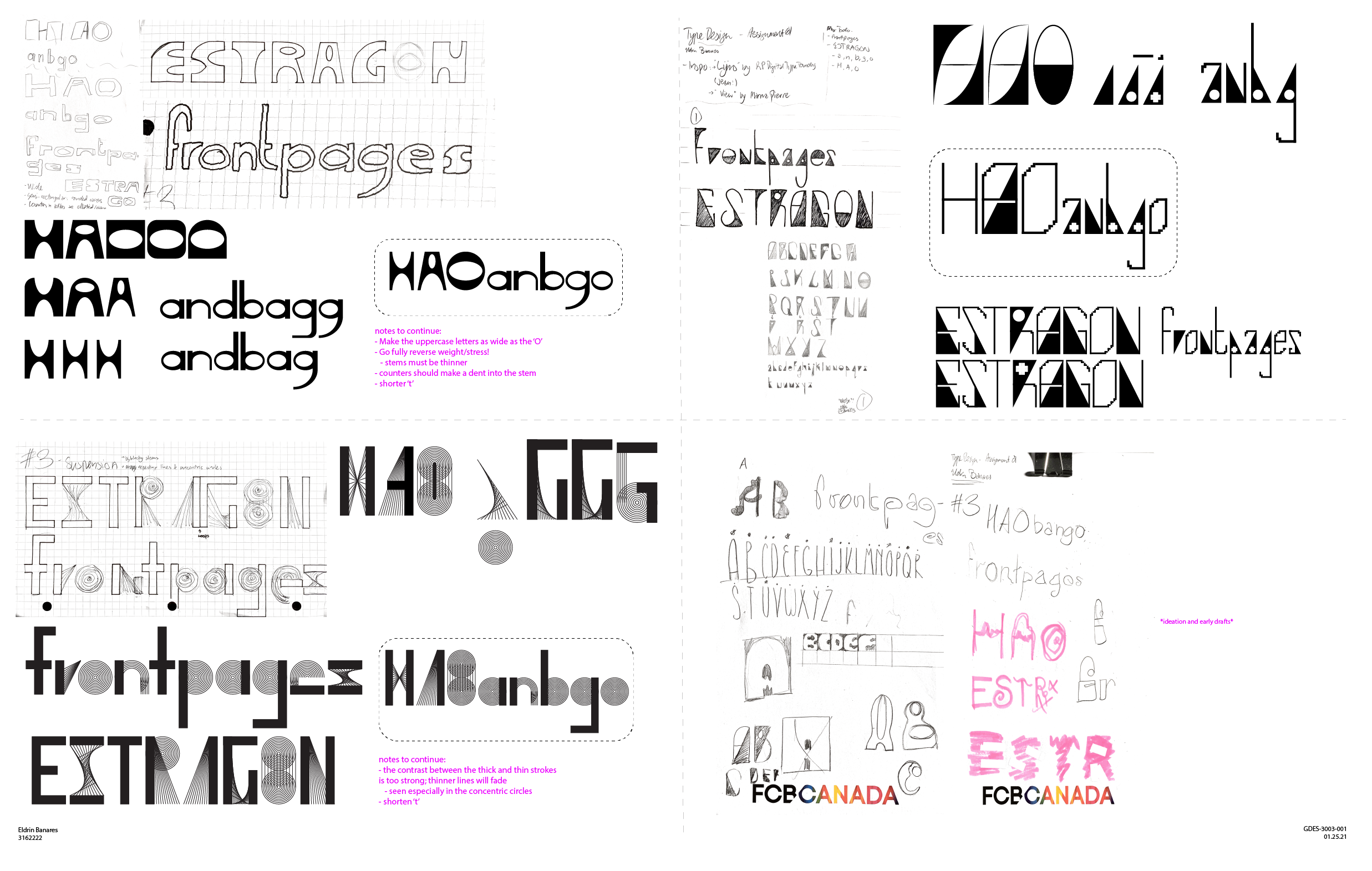
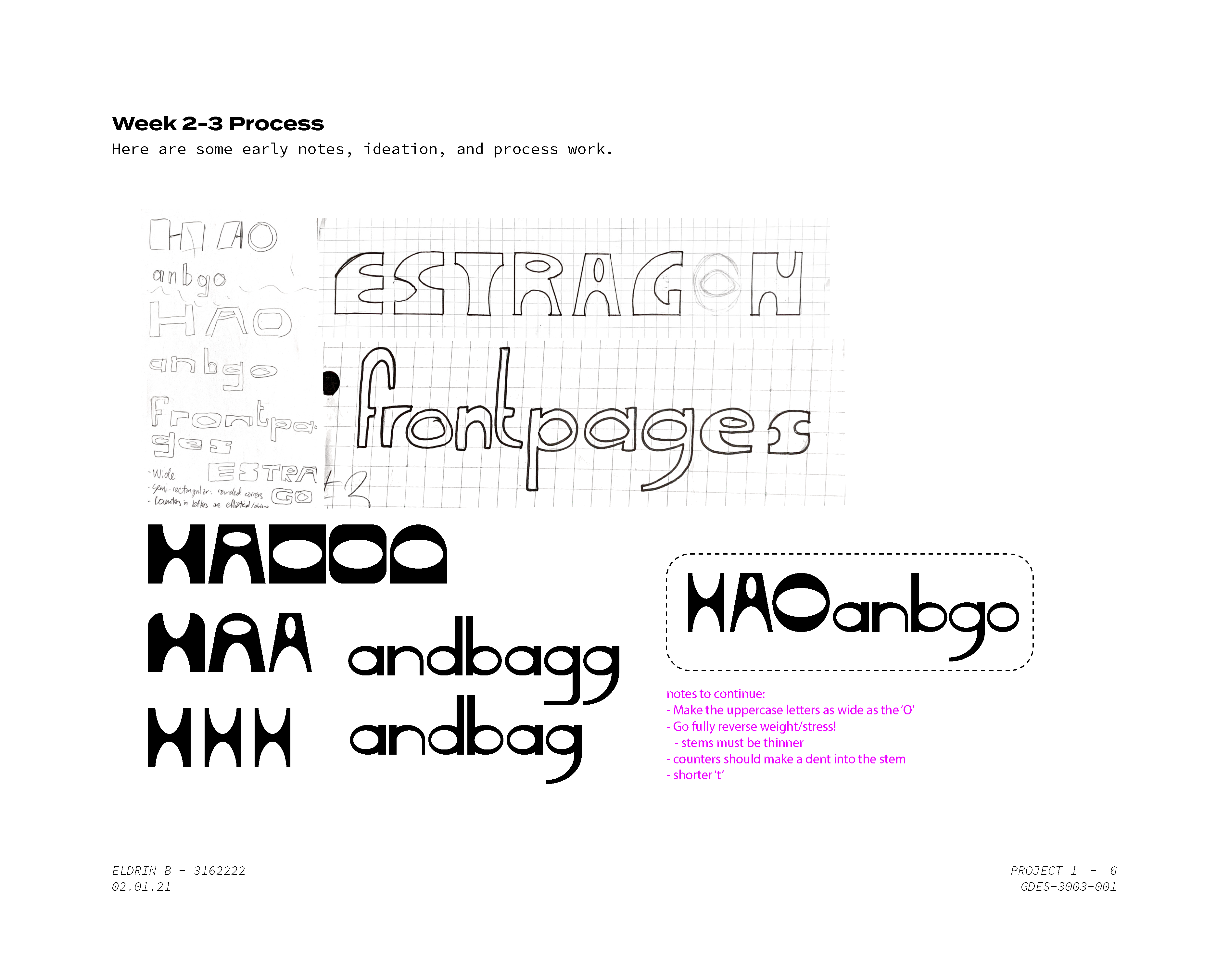
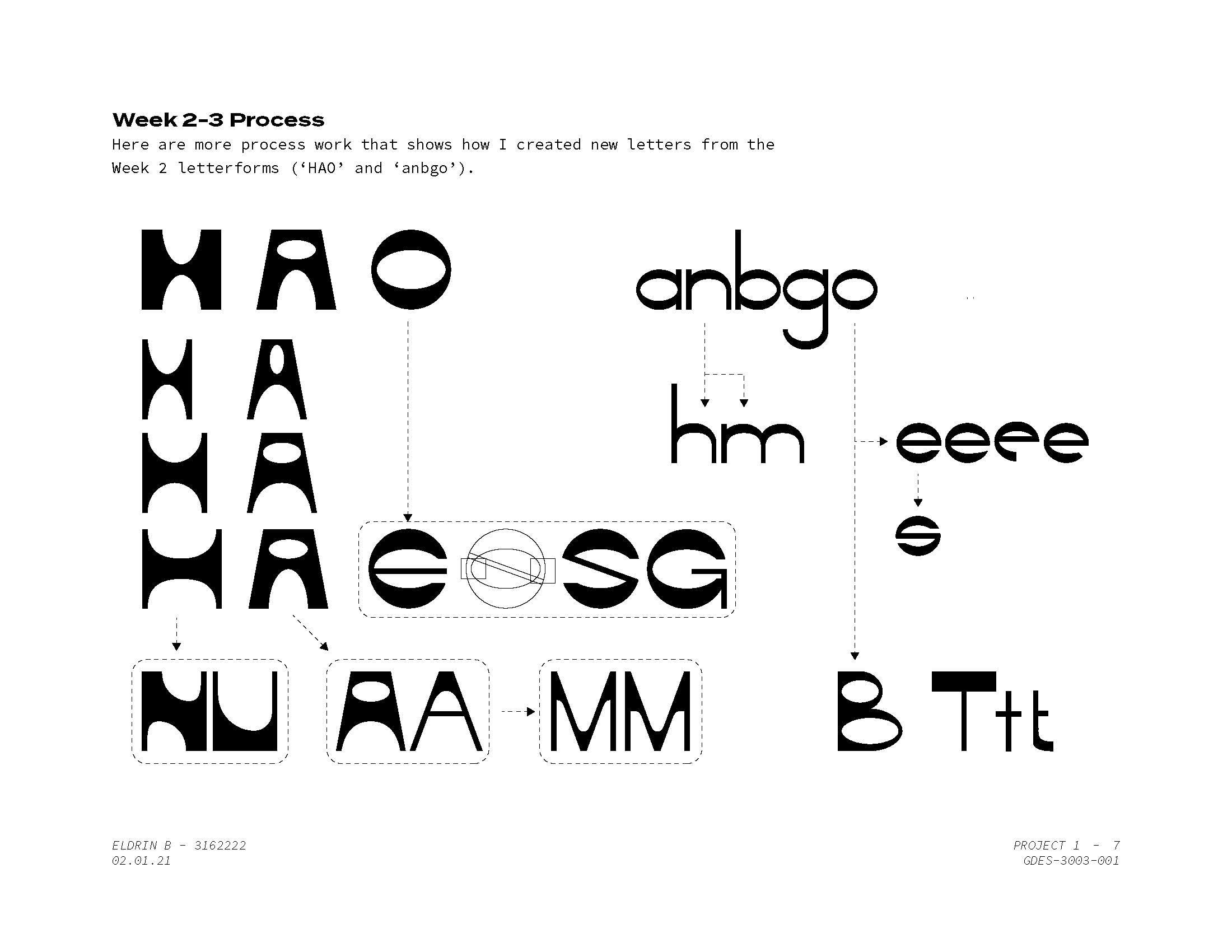
Early Digital Iterations
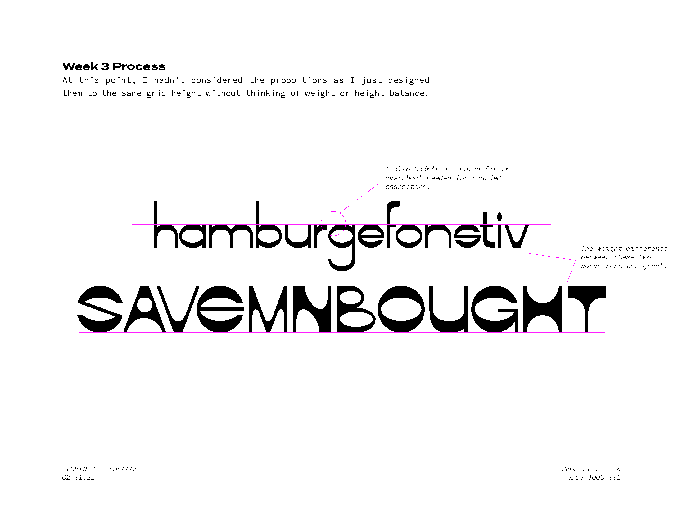
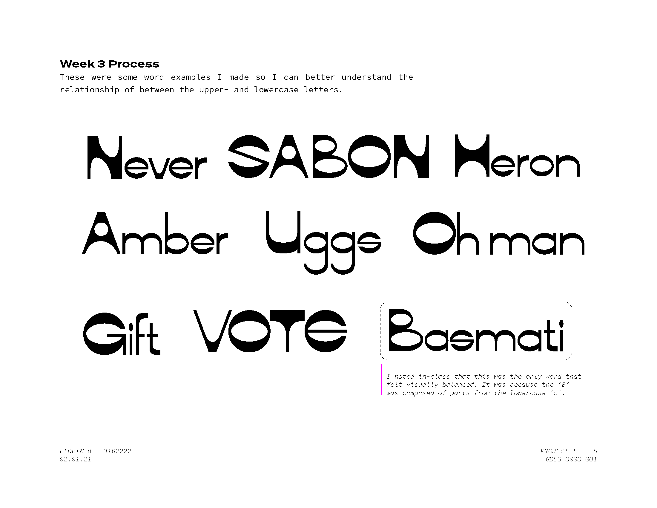
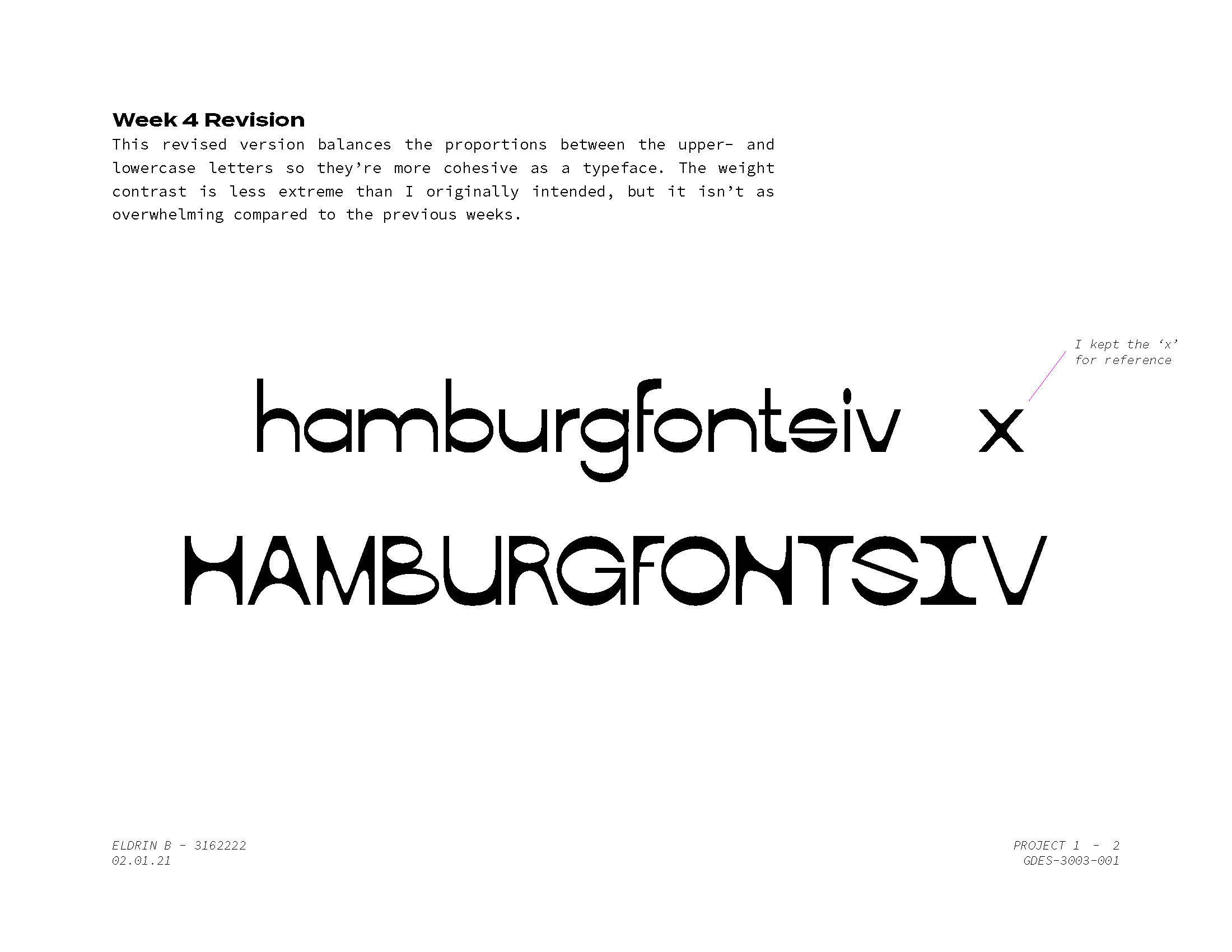
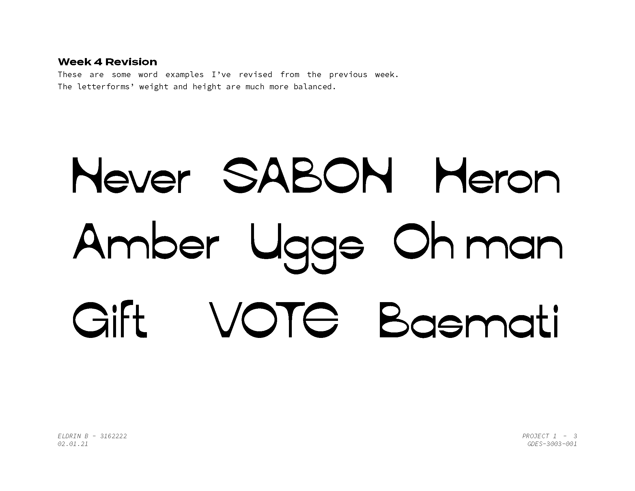
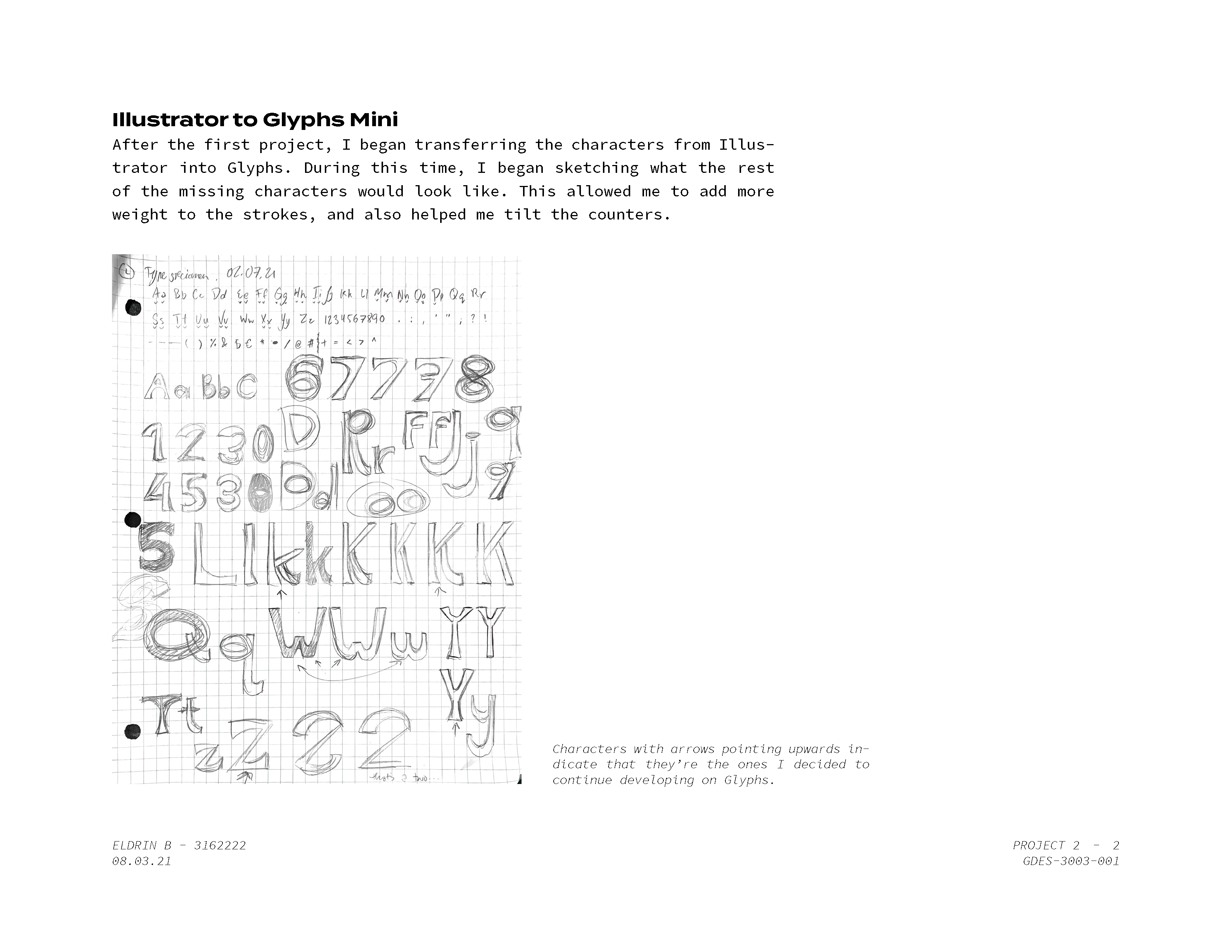
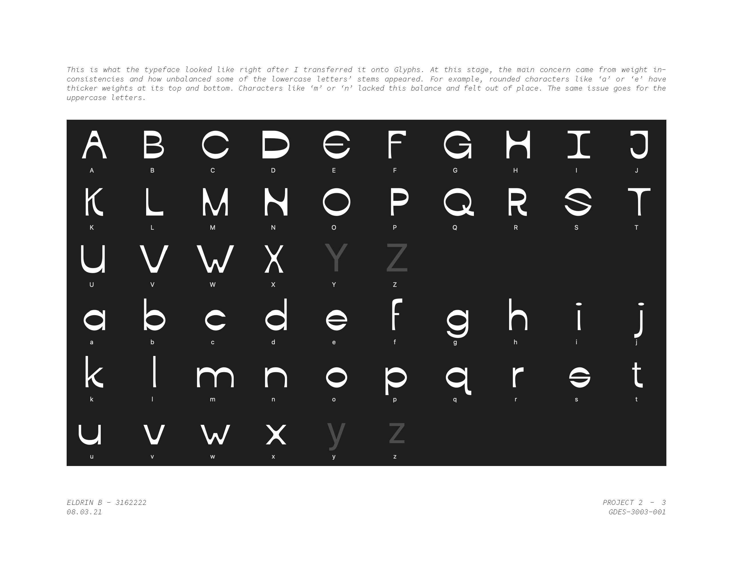
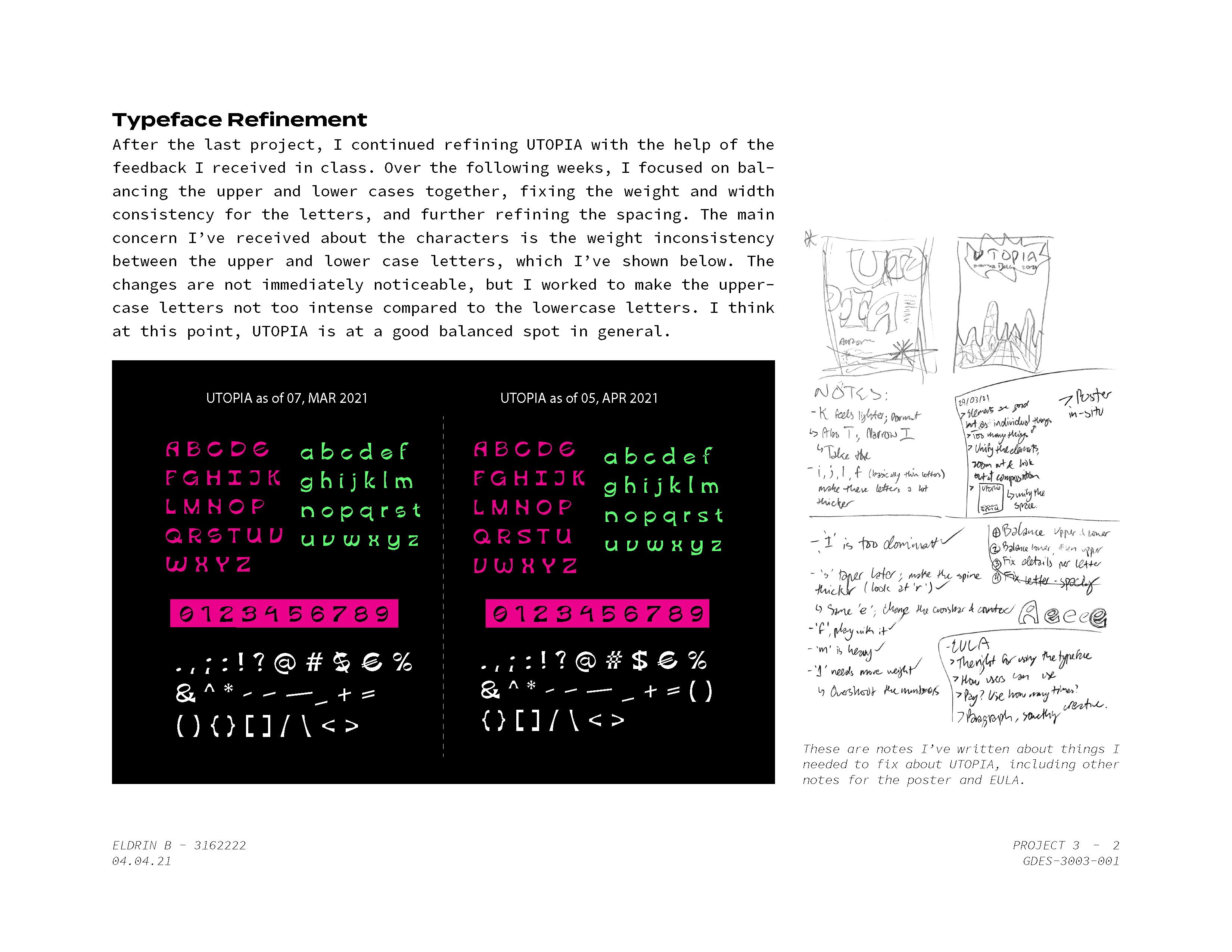
Here are early notes, sketches, and digital renderings of what would be UTOPIA. As the early weeks passed, I developed the typeface around a few select letters and the feedback of my instructor and peers. In this early stage, my main issue was the proportions between upper- and lowercase letters.
1 / 7
2 / 7
3 / 7
4 / 7
5 / 7
6 / 7
7 / 7
❮
❯
Refinement & Type Specimen
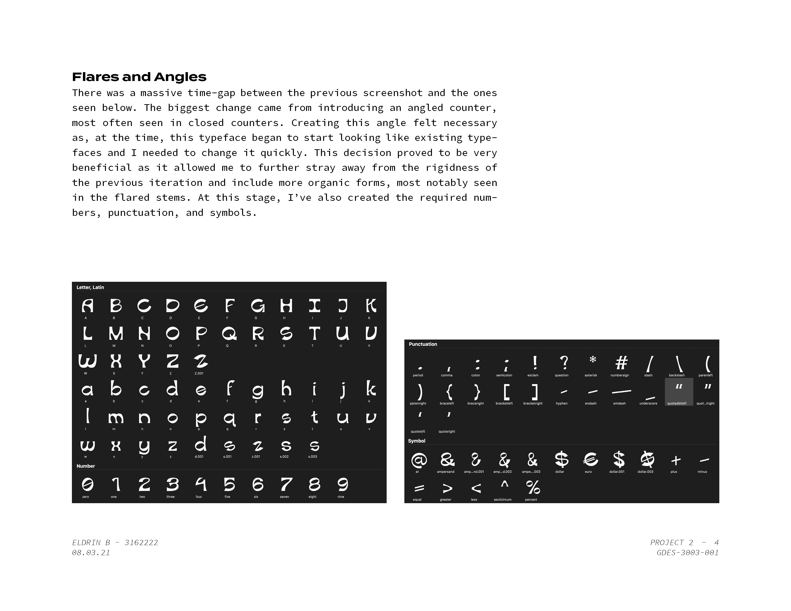
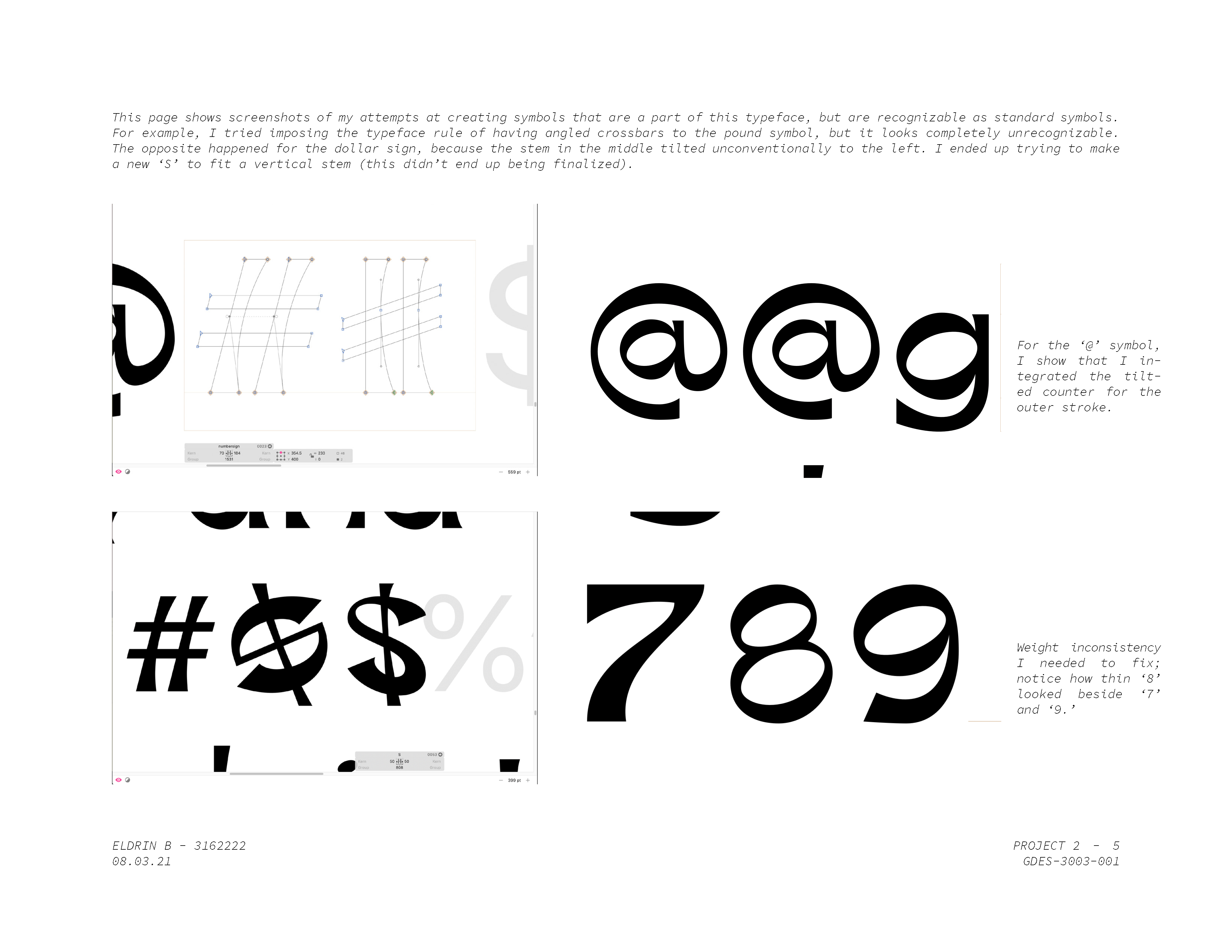
At this stage, I began using Glyphs Mini 2 to work on the rest of the alphabet, numbers, and symbols as it was a dedicated application for typeface design. I also shifted the typeface's form towards a more organic and free-flowing nature, as seen through the added flares and unorthodox counter angles. By the end of this stage, I created the Type Specimen, which meant the typeface was complete — only further refinement awaits it.
1 / 6
2 / 6
3 / 6
4 / 6
5 / 6
6 / 6
❮
❯
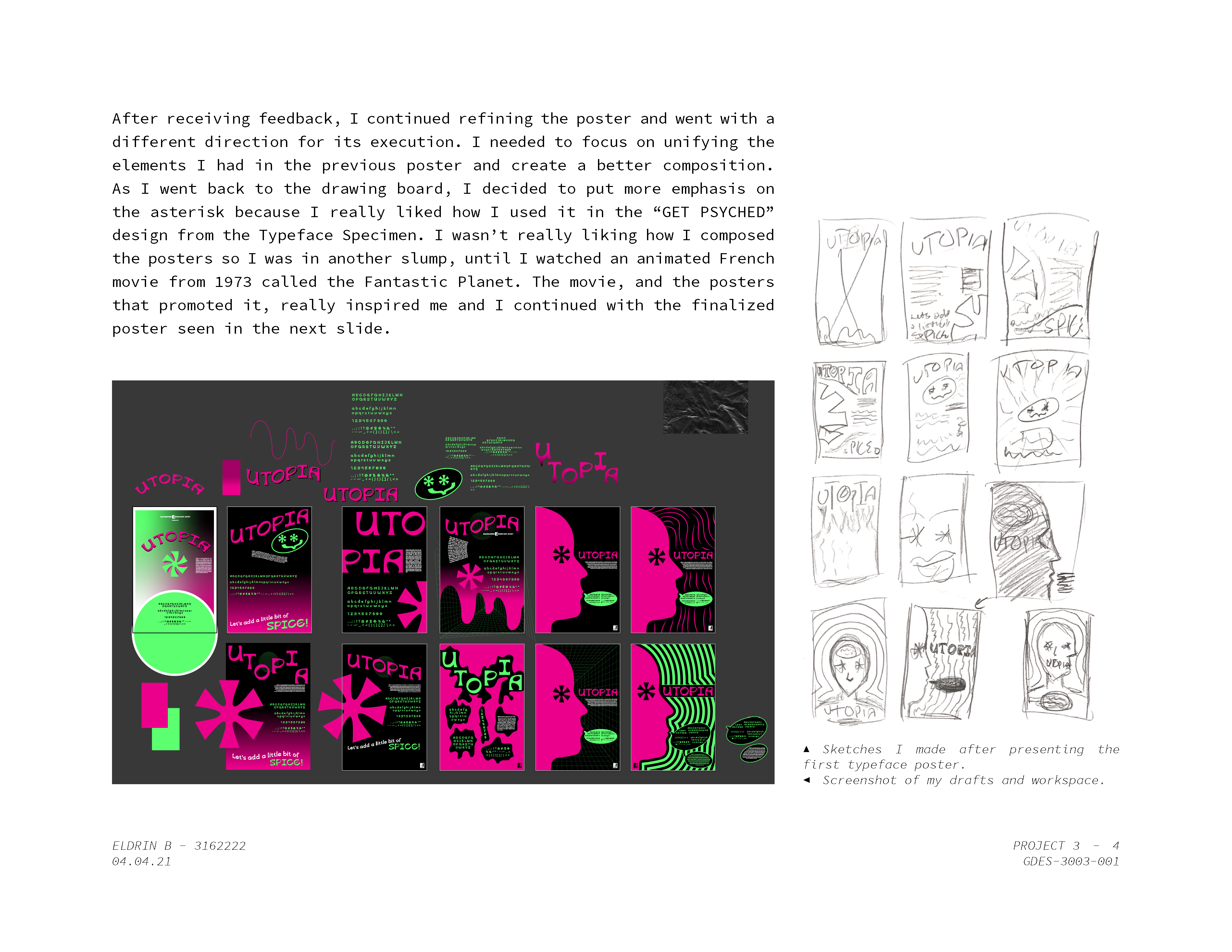
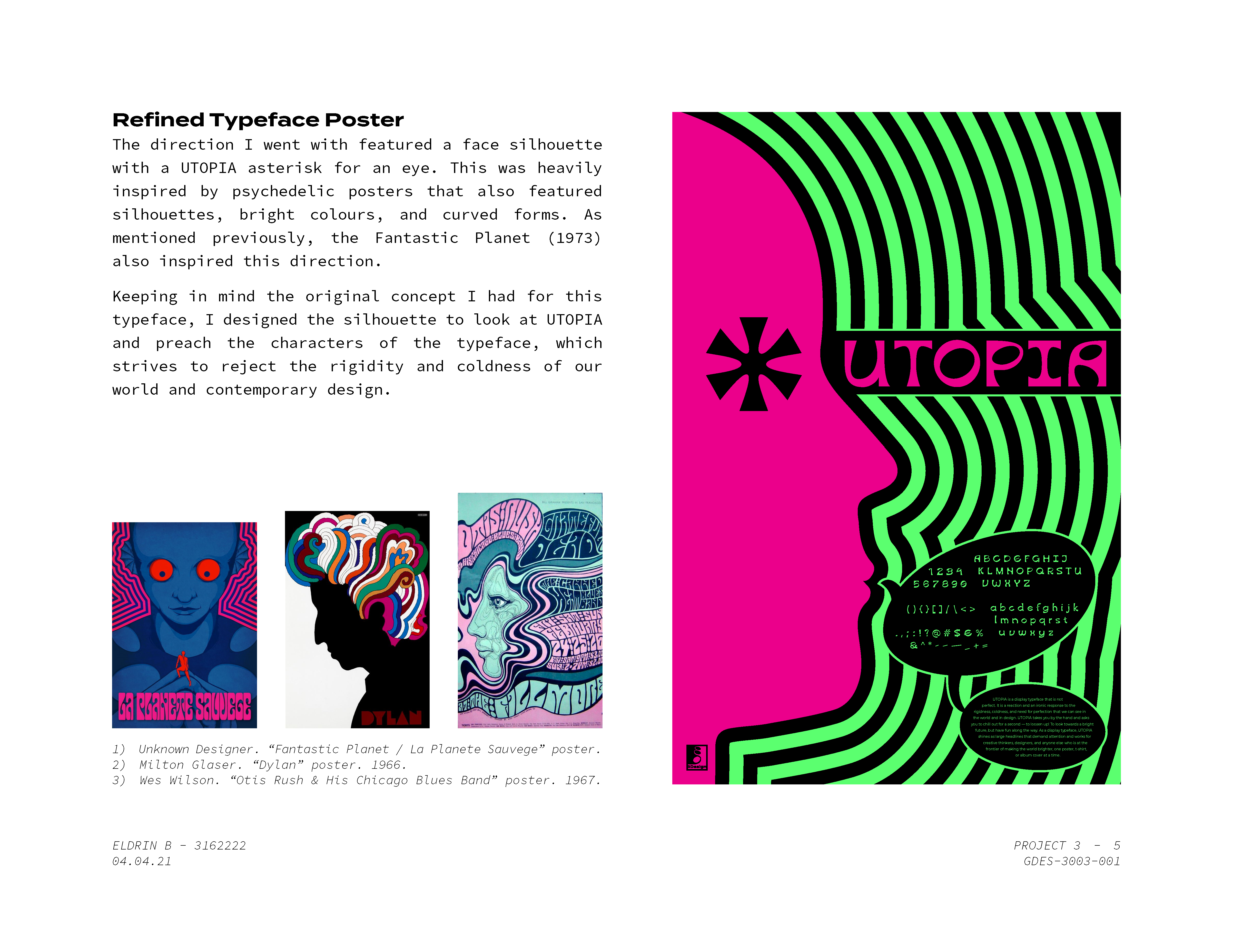
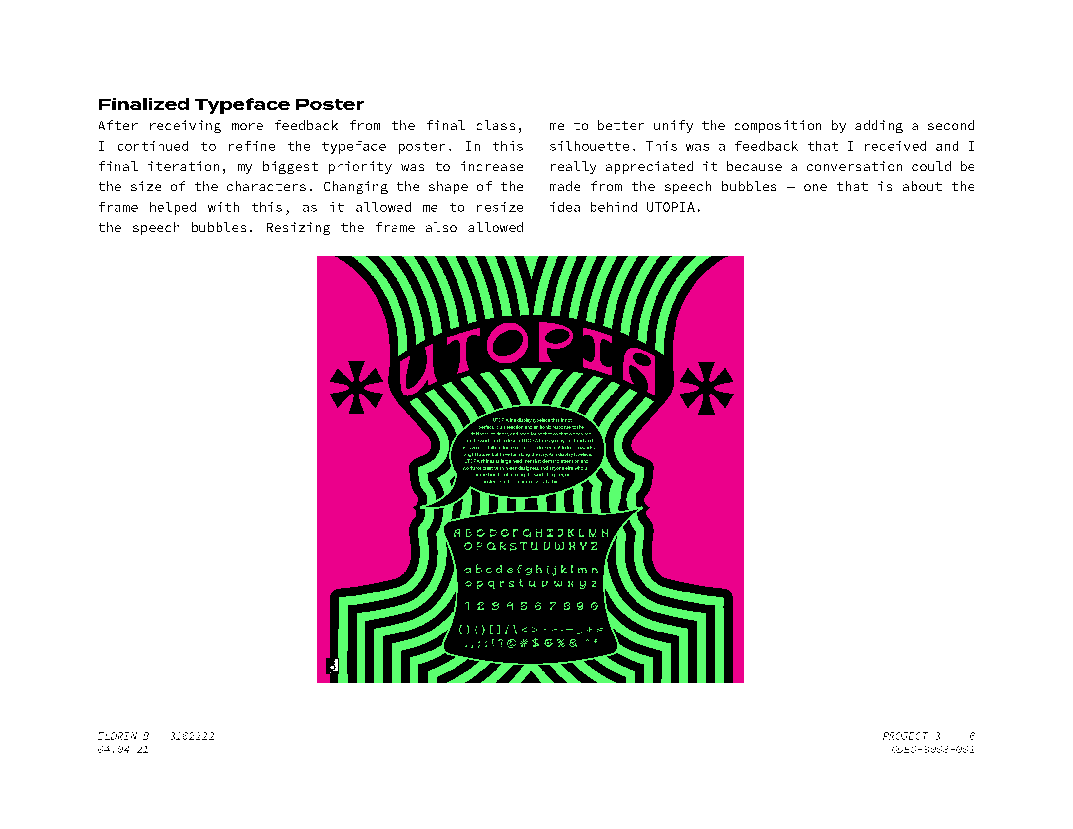
Finalization & Type Poster
This projects' finale consisted of receiving feedback, refining UTOPIA's details, and creating a poster that embodies the typeface we have created. It took a while to define what this poster would look like, but I looked to psychedelic posters and kept with UTOPIA's goal of rejecting the rigidity and coldness of our world. What resulted is a poster that shows a bright and colourful conversation behind the ideals of UTOPIA.